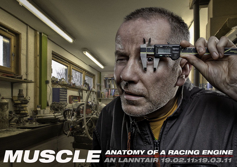
Anatomy of an Exhibition Poster
How two classic mid 1970s punk albums, a raven’s skull and the lighting techniques of Phoenix based photographer Joel Grimes provided the inspiration for an exhibition poster…
Back in February, An Lanntair, the Western Isles’ premier art gallery hosted an exhibition centred around my involvement with high performance aircooled Volkswagen engines, entitled: ‘Muscle: Anatomy of a Racing Engine‘. The plan, according to exhibition director Roddy Murray, was to attract a new group of people into the gallery. The four week period of the exhibition saw a healthy increase in the numbers of fathers and sons (petrol heads) coming through the doors and feedback has been very positive – apart from the odd grumble along the lines of it not being ‘art’. 🙂
Centrepiece of the exhibition was an exploded diagram of a VW engine but instead of using a workshop manual style illustration, we mounted the entire contents of a 2.3 litre race engine right across the main gallery wall. A section of the display would be made up of photographs of engines, engine parts and associated equipment. One of the photos would be used as an advertising poster.
Back tracking a little… in 2010 An Lanntair celebrated its 25th anniversary with an exhibition by local photographer made good, Murdo Macleod. A fitting choice as Murdo’s work had also been showcased at An Lanntair’s first ever exhibition, quarter of a century earlier.
By way of a nod to the gallery’s history, recent anniversary and Murdo’s fine work, I took as inspiration one of his photographs: Roy Keane with raven skull.
……………………………………………………….Roy Keane © Murdo Macleod 2002 (used with permission)
In place of the raven’s skull, I used something more appropriate to my line of work – a digital vernier caliper. For a little added interest, the caliper’s digital display was adjusted to read ‘666’.
The whole feel of the image was inspired by the work of Joel Grimes, pioneer of the three light, edgy look, where the subject is photographed in a studio and then cropped out of the picture and super imposed on a separately shot background scene. In Joel’s image of New Orleans musician Dre Merritt, Joel photographed Dre in the studio using a three light setup, then dropped him on to a five shot HDR background. The results from Joel’s lighting and post processing work are stunning: Dre Merritt – French Quarter © Joel Grimes 2010 (used with permission)
For my own low-tech version, I positioned myself in front of a white wall, also using a three light setup: one above me in a softbox and two behind at approx 45°, without modifiers to make for a harsher, harder light to contrast with the gentler light from the softbox above. The workshop background was photographed separately and consists of five shots in one stop increments, combined using Photomatix Pro to create a single HDR image. The portrait was cropped and dropped on to the workshop HDR background I’d prepared earlier.
Text for the poster was influenced by a couple of my long standing favourite debut albums. Two classics from the early New York punk era. Both were released around 1975/76. I’d also recently watched the film Helvetica. Yep, an entire film about a font!

The end result doesn’t really come close to a Joel Grimes creation, I’m not sure anyone got the Murdo Macleod raven skull reference and the font thing’s no big deal but you’ve got to get your ideas from somewhere!


